Before the structure of a Bayesian network (or the numerical parameters of an existing network) can be learned, it is a good idea to interactively examine the data. GeNIe allows for interactive editing data files in several aspects described in sections below. For the purpose of this section, we will be using data file retention.txt, which can be found in the examples sub-folder of the GeNIe installation folder.
Data Grid view
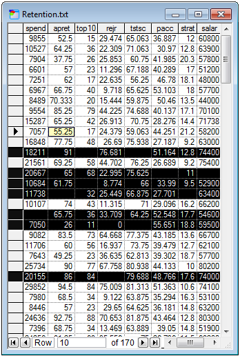
GeNIe uses the Data Grid view to display the contents of a data file. The grid is similar to a spreadsheet, like Microsoft Excel, and allows the users to analyze and clean the data. The bottom of the window shows the number of the row in which the cursor resides, along with the total number of rows. It is possible to type the desired row number and press Return, which will place the cursor in the row with that number.
The Data Grid view allows also for zooming in and out, similarly to the Graph View.
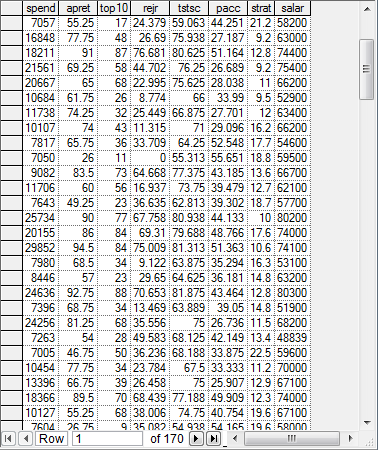
The columns hold variables (their IDs are in the first, grayed-out row), rows contain data records, which are simultaneous measurements of the states of the variables.
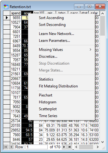
Similarly to Excel, Data Grid view allows for sorting data in ascending and in descending order. It is possible to sort using more than one column - just select them with CTRL or SHIFT. Please note that the order of selecting columns impacts the sort criteria. For example, with three columns (A, B, and C), if you click on C first and A second (with CTRL key down), C will be used first in sorting. The value of A will be relevant only if multiple records contain the same value in C. Sorting over multiple columns is useful if we want to find records in the data file containing a certain combination of values of variables. They are fairly easy to identify in a file sorted by the relevant columns.
The values of cells in the Data Grid view can be edited, similarly to cells in Excel. Rows can be deleted, which corresponds to removing data records from analysis. Groups of cells can be selected, copied, and subsequently pasted, both within the Data Grid view and between Data Grid view and external applications. Commands of the Edit Menu, such as Find and Replace can also be used in the Data Grid view, although Replace All takes effect only on the selected column.
Currently the Data Grid does not allow for adding, deleting, and renaming columns. Some of our users perceive this as a limitation and we are planning to add this functionality to one of our future releases. Deleting a column is easy to cope with currently, as learning always allows for selecting columns, so those columns that one might want to delete can be just omitted from the selection. Adding new columns can be simulated by creating a few additional dummy columns before data are read into GeNIe. Then, if an additional column is needed, one can paste data into one of those dummy columns and use is subsequently as a newly added column.
Changes to the Data Grid view are not transferred to the original data file. In order to make the changes permanent, you need to explicitly save the data.
Statistic
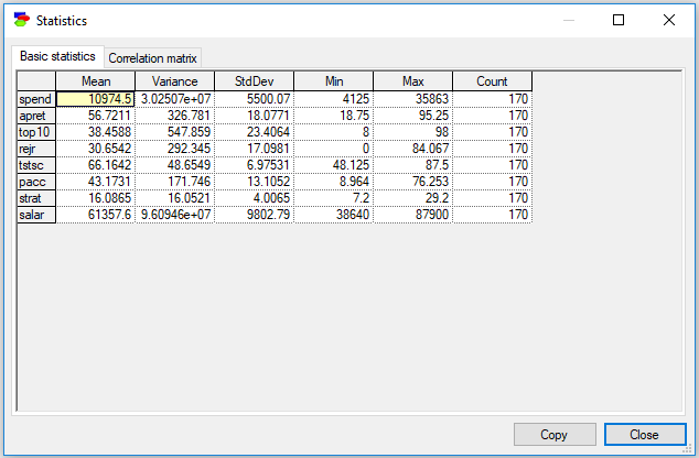
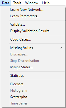
GeNIe allows to display basic statistics for the variables in the data set. These include: mean, variance, standard deviation, minimum and maximum value, and count (number of values in the column). To invoke the Statistics dialog, select Data-Statistics.
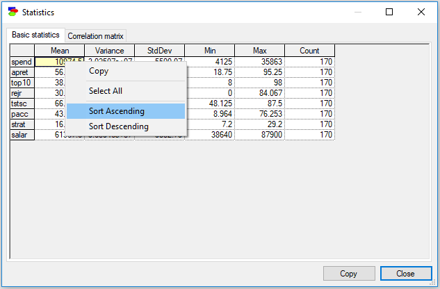
Values in various columns of the Basic statistics table can be sorted
In case of continuous variables following the multi-variate Gaussian distribution, Correlation matrix (second tab) offers also insightful information, showing correlations between pairs of variables. These correlations are indications of strength of (possibly indirect) relationships. Horizontal bars inside cells show the correlations graphically for easier visual identifications, green bars represent positive and red bars represent negative correlations.
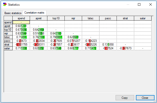
This tab can be sorted by individual columns as well and this operation is very useful in case of large tables - we may be able to find highest correlations between a chosen variable and the remaining variables.
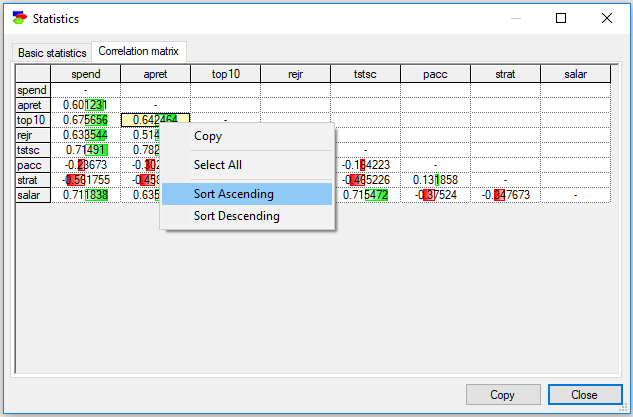
In this case, the variable that we are sorting on (apret in the screen shot above), is moved to the left-most column, so that all correlations with the variable can be shown in one column while preserving the triangularity of the matrix.
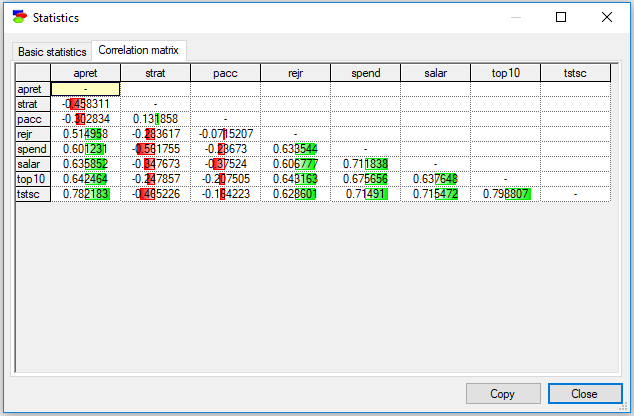
It is now convenient to notice that the variables with the highest correlation with apret are tstsc (78.2%) and top10 (64.2%).
In both, the Basic statistics and Correlation matrix tabs, scrolling the mouse wheel forward and backward with CTRL key pressed zooms in and out, respectively. Also, in both tabs, the Copy button places the contents of the grid (along with the headers) on the clipboard. Selecting parts of the grid and using the context menu to copy the selection will never copy the headers. The copied text can be pasted to other text editors.
Histogram
To see the distribution of the values in a column on a histogram graph select Data-Histogram after selecting a column or, at least, placing the cursor inside one of the columns.
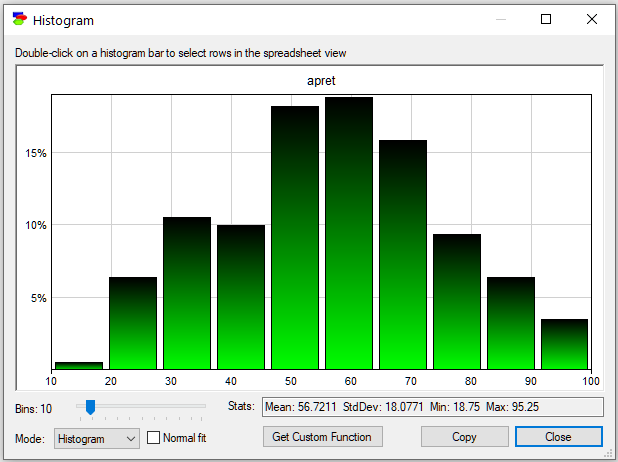
GeNIe displays a handful of parameters of the distribution (Mean, StdDev, Min and Max). It is well known that the shape of a histogram depends strongly on the number of bins selected. GeNIe allows you to change the number of bins interactively (the Bins slides in the lower-left corner). The following image shows the histogram of the same variable (apret) when the number of bins is 50 instead of the default 10 on the previous picture:
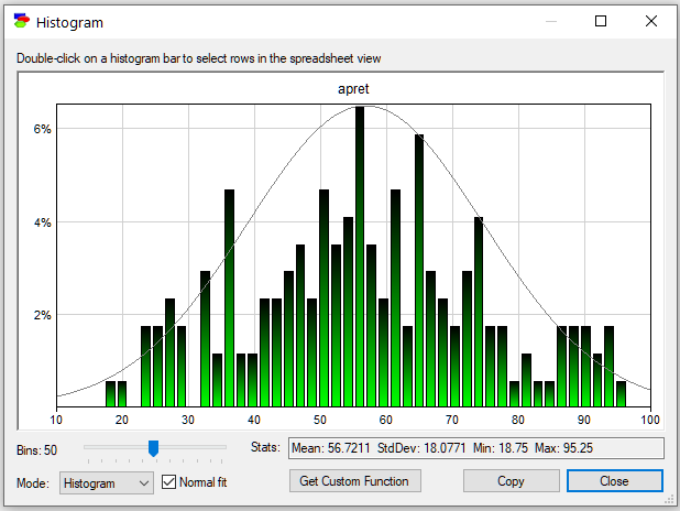
The histogram shows one more feature: Normal fit to the data, invoked by the Normal fit check box.
You can double-click a bar on the histogram to select all data rows that correspond to this bar. Histogram is always drawn of the selected rows (if no rows are selected, the histogram is of all rows). You can drill down the data by double-clicking on bars and then displaying histograms of the data that correspond to the selected bars.
You can copy the image of the histogram by clicking on the Copy button or right-clicking on it and selecting Copy from the pop-up menu that shows. To paste it into an external program as an image (bitmap or picture format, explained in the Graph view section), please use Paste or Paste Special. The default output of Paste is a text listing bin boundaries and counts. For the first histogram shown above, pasting will yield the following text:
apret
10 19 1
19 28 11
28 37 18
37 46 17
46 55 31
55 64 32
64 73 27
73 82 16
82 91 11
91 100 6
Get Custom Function button allows for learning a continuous probability distribution from the data describing the variable. For the first histogram above (with 10 bins), Get Custom Function opens the following dialog
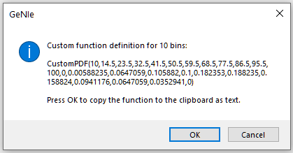
Pressing OK puts the following text on the Clipboard:
CustomPDF(10,14.5,23.5,32.5,41.5,50.5,59.5,68.5,77.5,86.5,95.5,100,
0,0.00588235,0.0647059,0.105882,0.1,0.182353,0.188235,0.158824,0.0941176,0.0647059,0.0352941,0)
The text describes a custom PDF function that can be subsequently used in the definition of a continuous node. The CustomPDF function's first argument is the number of intervals, followed by two lists, the breakpoints and their values. A large number of samples from this distribution displayed in a histogram with 10 bins looks as follows.
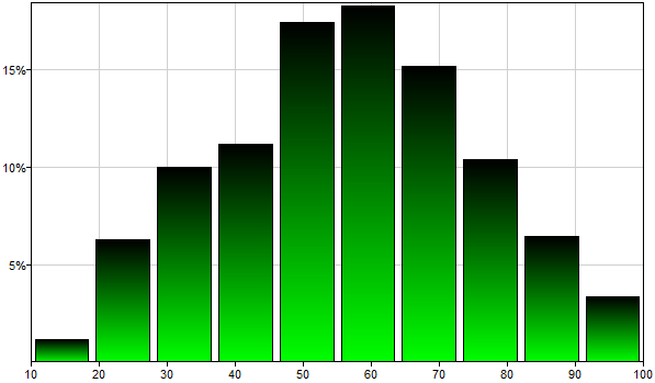
Please note that the shape of this histogram resembles to some degree the original histogram. The same histogram displayed with 100 bins looks as follows.
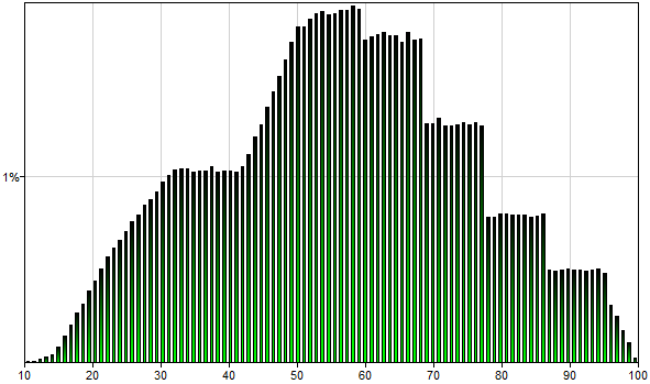
Please note that the shape of this histogram typically does not show steps but rather smoother transitions.
Histogram may be conditional. When a set of records is selected in the Data Grid view, the histogram will be based on just those records. Histogram of the variable apret in the retention.txt data file with the first 20 records selected will look as follows
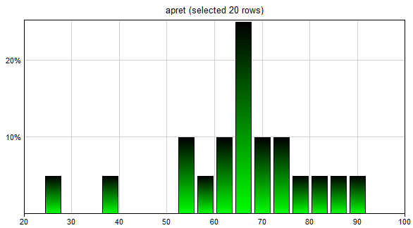
Please note that this functionality allows for learning conditional probability distributions. It is sufficient to make sure that the records selected are those fulfilling a specified condition. Once the (conditional) histogram has been displayed, we can follow the procedure for learning CustomPDF distribution, as described above.
Pie chart
To see the distribution of the values in a discrete (or discretized) column on a pie chart graph, select Data-Piechart. This will invoke the following dialog.
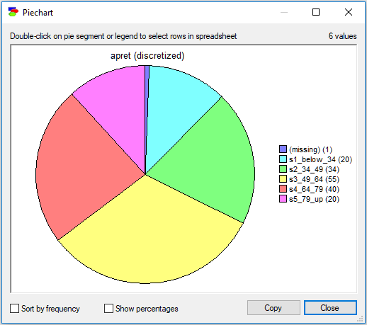
The Sort by frequency check box sorts the states in the legend on the right-hand side from the most to the least frequent values. This is convenient when some of the states are very unlikely and hard to identify.
Show percentages check box causes GeNIe to show percentages rather than counts next to the value.
Double-clicking on any segment of the pie chart or any of the small squares in the legend on the right-hand side selects records in the Data Grid view that correspond to the value represented by the segment.
You can copy the image of the pie chart by clicking on the Copy button or right-clicking on it and selecting Copy from the pop-up menu that shows. To paste it into an external program as an image bitmap or picture format, explained in the Graph view section, please use Paste Special.
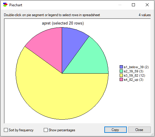
Pie charts may also be conditional. When a set of records is selected in the Data Grid view, the pie chart will be based on just those records. The pie chart of the variable apret in the retention_discretized.txt data file with the first 20 records selected will look as follows
Scatterplot
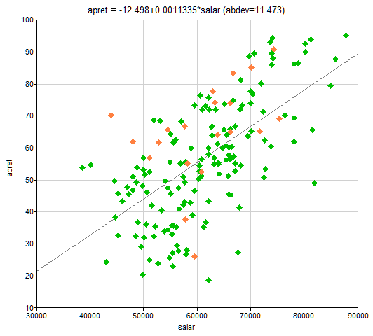
To see the joint distribution of two numerical variables, select two columns (by clicking on their IDs with CTRL key pressed) and select Data-Scatterplot. This functionality displays a scatterplot of the two variables, with the variable selected first being represented by the x-axis and the variable selected second being represented by the y-axis. Scatterplot between the variables salar and apret in the retention.txt data file will look as follows:
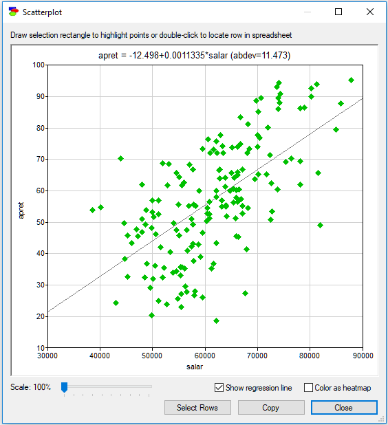
Color as heatmap option is useful in case of dense scatterplots and shows the density of the points on the plot.
Show regression line is useful in case of linear relationships between the variables. When this option is checked, GeNIe runs a linear regression of the variable on the y-axis against the variable on the x-axis. The equation of the line fitting the data points is displayed above the scatterplot along with the mean absolute deviation (abdev) in y of the points from the fitted line.
There is a close connection between the Scatterplot and the Data Grid. The Scatterplot displays rows that were selected before invoking it in orange color. Selecting any points on the Scatterplot and clicking on the Select Rows button exits the Scatterplot window and selects the rows corresponding to the selected points. Double-clicking on a point selects the corresponding data row in the Data Grid. This functionality is very convenient, for example, in case of identifying and removing outliers.
Scale allows for focusing on parts of the graph. Scaling the Scatterplot (Scale slider) helps in distinguishing points that appear close on the plot but in reality are distinct.
You can copy the image of the scatterplot by clicking on the Copy button or right-clicking on it and selecting Copy from the pop-up menu. The image can be then pasted into an external program, such as MS Word, in bitmap or picture format, explained in the Graph View section.
Scatterplots may be conditional. When a set of records is selected in the Data Grid view, the scatterplot will display the selected records in orange. Scatterplot between the variables salar and apret in the retention.txt data file with the first 20 records selected will look as follows:
Time Series
Finally, some data are time series and are best viewed in the original order. To see a plot of a single variable as a time series, select Data-Time Series.
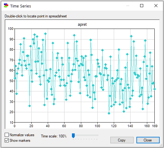
To show markers corresponding to the data points, select the Show markers check box. To normalize the values in the data so as the highest and lowest values take the highest and lowest points on the plot, select Normalize values check box. Time scale slider allows you to focus on parts of the plot in greater detail. Double click a point to locate the corresponding point in the data spreadsheet.
You can copy the image of the time series by clicking on the Copy button or right-clicking on it and selecting Copy from the pop-up menu that shows. To paste it into an external program as a bitmap image or picture format, explained in the Graph view section, please use Paste Special.
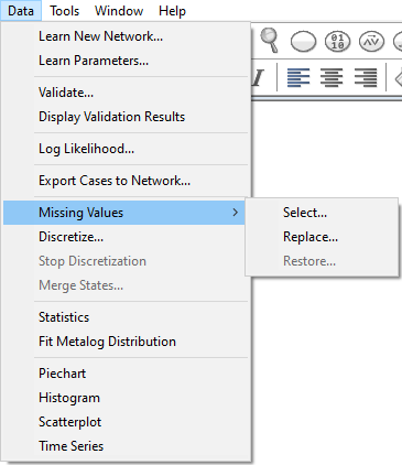
Missing Values
When learning the structure from a data set that contains missing values, one can use any available ML methodology to handle these missing values. One way of dealing with missing values is through deleting all records with missing values. This works when the number of missing values is small. Another way is imputation - one can replace the missing values by a value/label that will make it to the learned models. We advise the latter when the number of missing values is large.
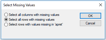
Missing values show as empty cells in the Data Grid. To select rows that contain missing values (for instance, for deletion) select Data-Missing Values-Select...
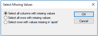
You will be given three options: (1) Select all columns with missing values, (2) Select all rows with missing values, and (3) Select rows with values missing only in 'apret' (the currently selected column):
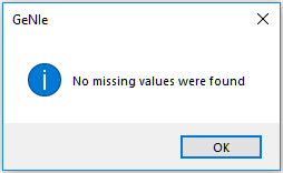
Selection of columns helps in identifying variables that have missing values. If the data file did not contain any missing values, GeNIe will inform you about that:
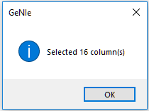
Otherwise, GeNIe will confirm how many columns it selected:
The second and the third choice allow you for selecting data records with missing values in any cells and in the currently selected variable respectively. A column in the data grid is considered selected if the cursor is placed in any of its cells.
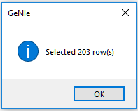
If the data file did not contain any missing values, GeNIe will inform you about that. Otherwise, GeNIe will confirm how many rows it selected.
Selected rows will be highlighted in the Data Grid View:
Very often, selection is the first step to deleting records, which is one way of dealing with missing values in structural learning. This approach works if the number of records with missing values is relatively small.
If the data file contains any missing values, you may choose to replace them with something - this is also a way of dealing with missing values. To do that, select Data-Missing Values-Replace... You will be given a choice to replace (1) with a specific value or (2) with an average of the selected column. The values will be replaced only in the currently selected column.
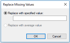
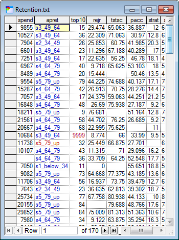
The replaced values will be distinguished with a red color, like on the screen shot below (the missing values were replaced in column top10 with the value 9999):
You can rollback all the replace actions on any of the columns by selecting the column itself (putting the cursor in one of its cells) and selecting Data-Missing Values-Restore... The inserted values will be removed from the data grid.
Discretization
GeNIe offers a powerful interface for interactive discretization of continuous variables. To invoke the discretization interface, select Data-Discretize...
The interface gives you a choice of discretization method (Method), the number of discretization intervals (Bin count), and a Prefix for the automatically assigned labels for the intervals. There are three discretization methods implemented in GeNIe now: Uniform Widths, which makes the widths of the discretization intervals the same, Uniform Counts, which makes the number of values in each of the discretization bins the same, and Hierarchical, which is an unsupervised discretization method related to clustering. We do not have the literature reference handy but here is a sketch of the algorithm implemented in GeNIe:
Input: N=# of records, K=# of desired bins
1. Let k denote the running number of bins, initialized to k=N (each record starts in its own cluster)
2. If k=K quit, else set k=k-1 by combining the two bins whose mean value has the smallest separation
3. Repeat 2
Discretization is performed once you press the Discretize button. The interface displays the distribution of records among the new intervals (as a pie chart) and a probability mass function with the histogram of the original continuous data in the background. The colors of the intervals correspond to the colors in the pie chart and in the histogram. Please note that, similarly to the histogram interface, you can modify the bin count for the histogram. You can modify the discretization boundaries by entering the new values directly into the table or by clicking and dragging the interval boundaries on the data histogram.
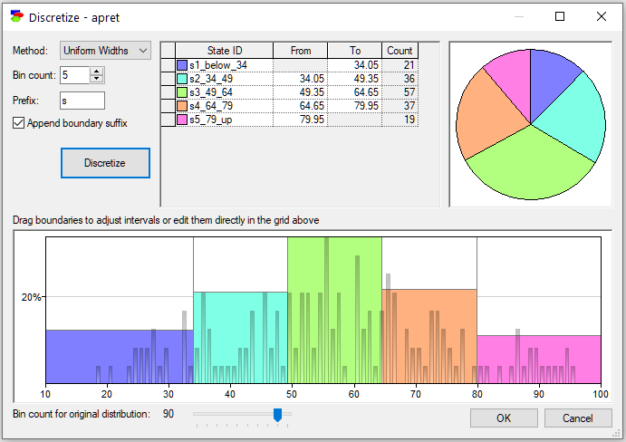
The pictorial representation of the discretization can be copied and later pasted into another application for the purpose of documentation or reporting. To copy the pictorial representation of the discretization, right-click on it, select Copy, and subsequently choose Paste Special in the destination application.
Once you accept the changes (by clicking on the OK button) the discretized column will be shown in blue font in the Data Grid View. You can reverse discretization at any time by selecting Data-Stop Discretization option from the main menu.
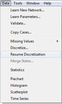
You can resume a stopped discretization at any time by selecting Data-Resume Discretization. The values will be restored to the last successful discretization.
Merging States
Sometime, through an error in the data collection or encoding, two or more states may denote the same value. For example, female and woman may all refer to the same value. GeNIe allows to merge such states into one through the Merge States... functionality from the Data Menu. To merge states of a variable, select the column that represents it and select Data-Merge States...
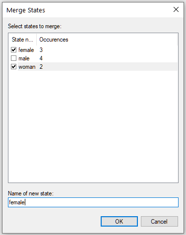
Select the states that you want to merge together and provide the name for the resulting state. You can see that GeNIe gives you information about the number of occurrences of each of the states of the selected variable. The effect of this operation will be that all five states (female and woman) will be changed into female. The Merge States command can be viewed a convenient shortcut for a series of Replace All commands.
Edit Menu for Data Spreadsheets
Edit Menu has additional choices for data spreadsheets:
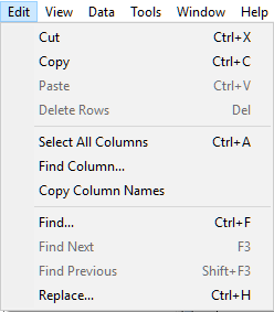
While the commands like Cut, Paste, Find, and Replace have obvious meanings for data spreadsheets, the three additional commands deserve a brief explanation.
Select All Columns selects all columns in the data spreadsheet. This is useful as a preparation for the Copy Column Names, which copies the names of the selected columns. This functionality is useful in creating a list of columns to be pasted into a text editor or pasting them in the Learn New Network dialog.
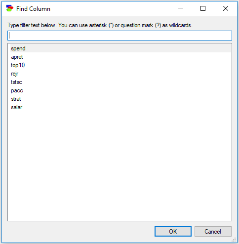
Find Column is useful when the data file has many variables/columns. When their number is large, scrolling the screen sideways to find a desired column may be challenging.
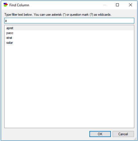
Typing anything in the filter field causes the dialog to limit the names of columns to those that match the filter. For example, typing an "a" into the above dialog will lead to the following selection:
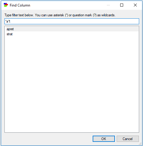
Letter case is ignored, so a lower case letter (e.g., "a") is equivalent to an upper case letter (i.e., "A"). In addition to regular characters, the filter field interprets wildcard characters, such as an asterisk (*) or a question mark (?) similarly to Windows. Typing "*a*t" will select only those column names that have an "a" character and end with a "t":
Double-clicking on any of the column names or selecting a column name and pressing OK will select that column in the data spreadsheet.