When an equation node is updated, hovering over its Updated (![]() ) icon shows the result in form of the marginal probability distribution over the node. Here are the results of the three variables in the example used throughout this section:
) icon shows the result in form of the marginal probability distribution over the node. Here are the results of the three variables in the example used throughout this section:
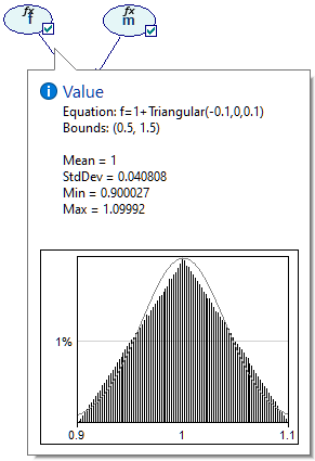
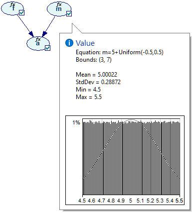
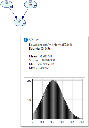
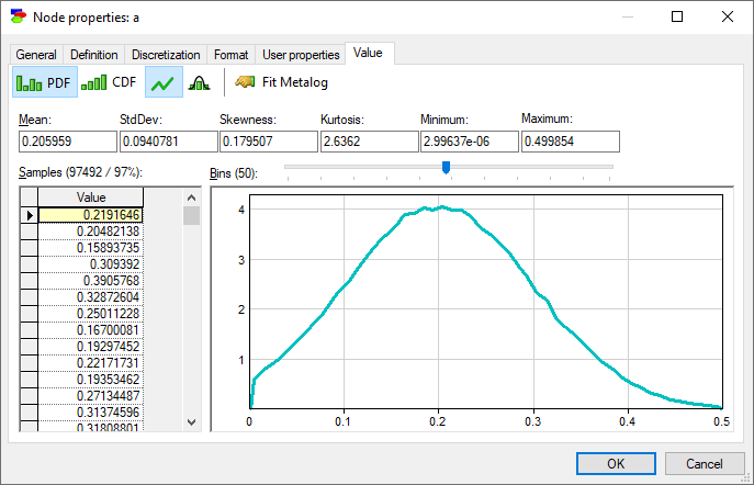
We can examine these distributions in more detail on the Value tab of the Node properties. Node a is most interesting from the point of view of the model.
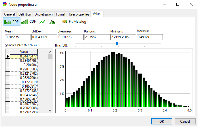
Equation nodes are continuous and show the results in form of a plot of the samples obtained during the most recent run of the sampling algorithm. The samples themselves are preserved and displayed in the vector on the left-hand side. The tab shows the first four moments of the marginal distribution over a: Mean, StdDev, Skewness and Kurtosis along with the Minimum and the Maximum. Similarly to the histogram interface in the data pre-processing module, the user can change the number of bins in the histogram.
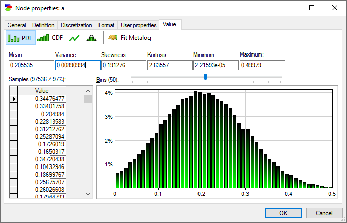
A somewhat hidden feature of this dialog is that one can switch between StdDev and Variance by double-clicking on their text boxes. The same can be done for Kurtosis, which can be switched to Excess Kurtosis.
It is worth noting on the side that when a sample is invalid (nan, i.e., not a number), it is displayed as a nan and highlighted in orange. The values of Minimum and Maximum in the screen shot below are shown in red because the samples from which they are derived fall outside of the range designated on the definition tab ([0..0.5]).
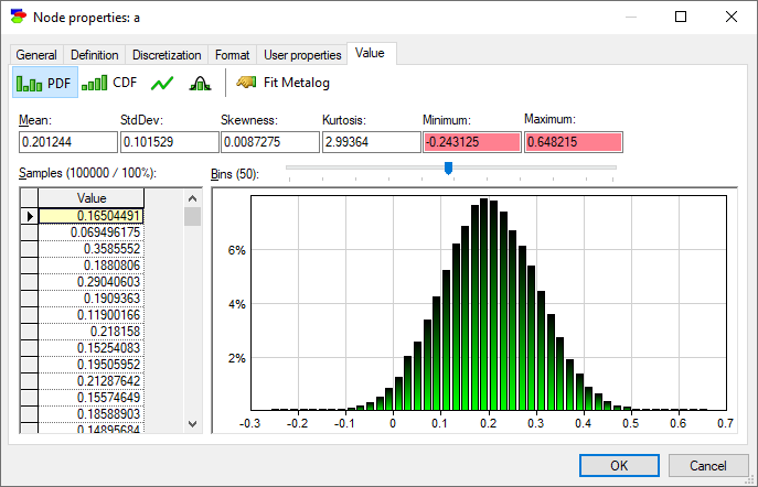
It is possible to reject all invalid and out-of-bounds sample during the sampling process by setting the Reject out-of-bounds and invalid samples option in the Inference tab of the Network properties. Invalid and out-of-bounds samples are treated in the same way - they are rejected as soon as they appear.
Pressing various buttons in the toolbar on the top of the tab allows for choosing different plots.
Show probability density function (![]() ) button (default) shows the histogram of samples, as in the screen shot above.
) button (default) shows the histogram of samples, as in the screen shot above.
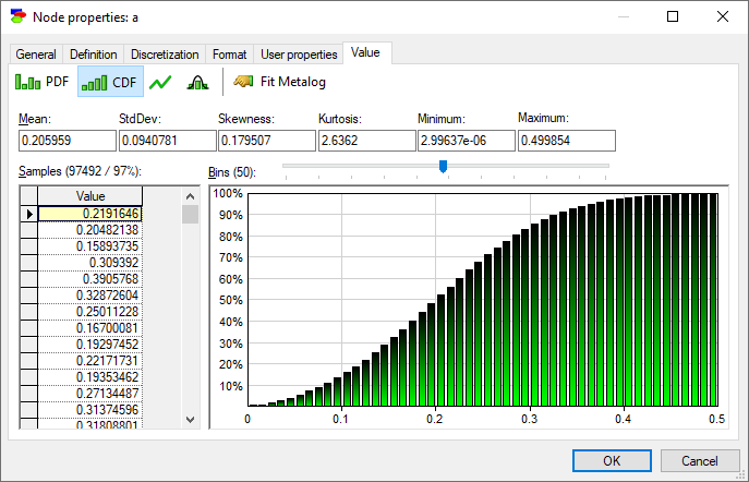
Show cumulative probability function (![]() ) button shows the cumulative histogram of samples.
) button shows the cumulative histogram of samples.
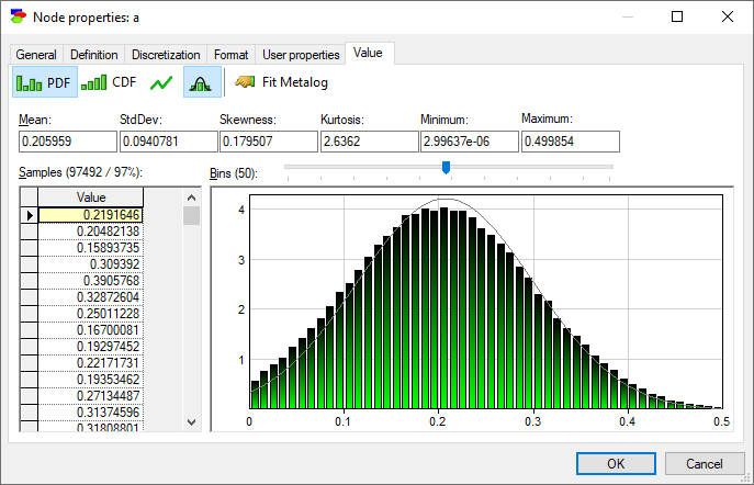
Display density function as line chart (![]() ) button changes both histograms into lines.
) button changes both histograms into lines.
Show normal distribution over density function (![]() ) button fits Normal distribution with the mean and standard deviation equal to those of the samples to the plot.
) button fits Normal distribution with the mean and standard deviation equal to those of the samples to the plot.
Finally, Fit metalog distribution (![]() ) button invokes the Metalog Distribution dialog that allows for fitting a metalog distribution the samples.
) button invokes the Metalog Distribution dialog that allows for fitting a metalog distribution the samples.
It is useful to note that the marginal probability distribution of a does not follow the Normal distribution - while its probability density function (PDF) follows a uni-modal bell-shaped curve, there is a visible difference between the curve and the Normal distribution plotted alongside. This is not surprising given the definition of variables a, f, and m.
With the AutoDiscretize algorithm used for inference in continuous models, the Value tab of Equation nodes is identical to those of Chance nodes in Bayesian networks.
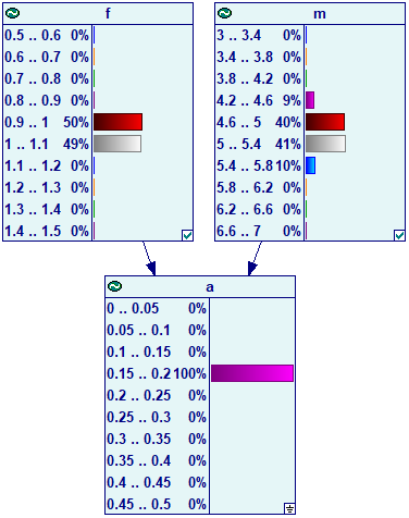
It is also possible to view the marginal probabilities in continuous and hybrid models by changing the view from Icon to Bar Chart. In case of the sampling algorithm, the results are displayed as follows:

When we enter evidence in a node with parents (in this case, evidence in node a), GeNIe invokes the auto-discretization algorithm and the results look identically to those of discrete Bayesian networks: