Note: All operations performed using the Format toolbar are applicable to the currently selected item in the Graph View. All new items created follow the current settings on the Format toolbar. Tree View cannot be changed using the Format Toolbar.
The Format toolbar includes tools for refining the aesthetic aspects of the Graph View. It can be made invisible using the toggle command Toolbar-Format on the View Menu. It can be also moved to any position on the screen in its free floating form. To move the toolbar from a locked position, click on the vertical bar at the left edge of the toolbar and drag it to its destination. The Format toolbar has buttons for changing font, color, and size of the text, and for alignment of text and various nodes in the model.
Here is the Format toolbar
In its free-floating form, the Format toolbar appears as follows

Font properties buttons
allow for selecting the font, its size, and appearance (Bold or Italic).
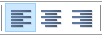
Text justification tools
allow for specification of the text alignment within text boxes, notes, and nodes.
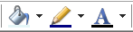
Color tools
allow for setting the interior color of node and submodel icons, line color, and text color. This is similar to color selection in the Format tab of Node Properties sheet.
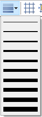
Line width pop-up tool is used to select the width of the boundary lines of the node/submodel icons.
Node/Submodel Align buttons
become active when at least two nodes are selected in the Graph View. They allow for aligning the drawing of nodes to each other or to the grid. Their functionality is self-explanatory and essentially similar to the functionality of most drawing software packages.
Show gridlines toggles display of the grid, i.e., a mesh of perpendicular horizontal and vertical lines in the background of the Graph View. The grid is useful in drawing and aligning nodes.
Align to grid aligns the tops and left sides of selected objects to the nearest grid lines. At least one object must be selected for this option to be active.
Align left and Align right align the leftmost and rightmost points of the selected objects, respectively.
Align top, Align bottom align the tops and bottoms of the selected objects, respectively.
Center horizontally and Center vertically align the object centers in horizontal and vertical direction respectively.
Distribute horizontally and Distribute vertically distribute evenly the selected objects respectively horizontally and vertically between the position of the farthest nodes. Both tools will be active only if at least three objects are selected.
Bring to front brings the selected object to the front so that none of its parts is covered by other objects.
Send to back sends the selected object to the back so that none of its parts covers any other objects.
Finally, Resize to fit text changes the size of the selected nodes so that the text displayed in the nodes shows in its entirety.
The functionality of Node/Submodel Align buttons is repeated in the Layout menu
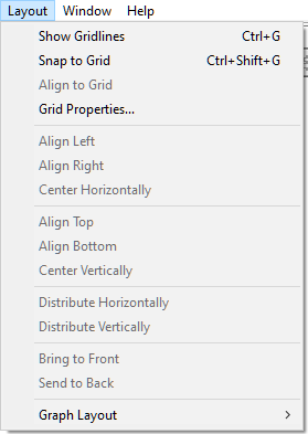
There are two additional functions offered by the Layout menu that are not offered by the Format toolbar:
Snap to grid makes all new nodes that are created in the Graph View aligned to the grid. (If you want to align existing nodes to the grid, select them and use the Align to Grid tool, described above.) When Snap to grid is on, dragging of nodes, with the Snap to Grid option on, will not be smooth, as nodes will jump from one grid line to another.
Grid Properties... opens up the Grid Properties dialog shown below
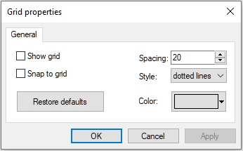
Show grid checkbox has a same function as the Show Gridlines option in the Layout menu. When checked, the grid lines are displayed in the Graph View.
Snap to grid checkbox has the same function as the Snap to Grid option in the Layout menu. When checked, all new nodes created will be automatically aligned to the grid.
Spacing defines spacing (in pixels) between the lines of the grid. A smaller value will result in a finer grid.
Style defines how the grid lines will be displayed:
Solid lines makes the grid lines solid.

Dotted lines makes the grid lines dotted.

Dots makes only the intersection points of the grid lines displayed.

Color sets the color of the grid lines. You can select any color from the palette or define your own color. Grid color selection is similar to color selection for nodes. While darker colors are better when the grid style is dotted or dotted lines, we advise lighter colors for solid grid lines so that they do not clutter the Graph View unnecessarily.
Restore Defaults restores the grid display settings to the original factory settings.