This section offers an informal introduction to QGeNIe, similar to the light introduction to the C programming language offered by Brian Kerninghan and Dennis Ritchie in their milestone book (see Kernighan & Ritchie, 1988). We will show you how to create a simple qualitative Bayesian network model, how to save and load it, and how to use it to answer simple questions. Once you have made yourself familiar with QGeNIe in this informal way, you can proceed with the Elements of QGeNIe chapter, which offers a thorough introduction to various elements of QGeNIe.
QGeNIe is an interactive program that allows for rapid creation of causal models in uncertain domains. These models represent propositions by means of nodes, which always take two possible values: True and False. Even though the underlying methodology is quantitative and grounded in probability theory, models created in QGeNIe use no numbers and rather qualitative sliders, colors, and gradients. Degrees of truth of propositions are represented by colors. Mathematically speaking, they represent the probability of the state True (or False - it is the users' choice). While QGeNIe users can define the color scale themselves, the default color scale is a range between red and green, representing undesirable and desirable states. QGeNIe allows for an interactive exploration of the models, examining the effects of observations and manipulations of individual variables. The focus of reasoning in QGeNIe are not exact probabilities but rather sign and order of magnitude effects that can be perceived by means of colors.
We will demonstrate the basic functionality of QGeNIe on a simple model that will describe relationship among four variables: High Productivity, Hot Weather, Climate Control in the Building and Work To Do. Each of these variables is propositional and can take two states: True and False. Through this modeling effort, we would like to create a model that will answer the following questions: What is the expected impact of failure of the climate control in the building on productivity on a hot day and on a normal day respectively? We would also like to obtain the conditional probability table for the variable High Productivity for a further use and refinement in GeNIe. While this example contains only four variables, it illustrates all basic concepts, which once understood can be used in building more complex models. Please keep in mind that the functionality covered in this section merely touches what you can do with QGeNIe and gives you just a taste of qualitative Bayesian modeling.
If you have not already started QGeNIe, please start it now.
A. Let us create the nodes that will represent the variables in our model.
The Tool Menu shows a list of model elements that you can create. These are also displayed as buttons on the Standard Toolbar.
Select Node button (![]() ) from the Standard Toolbar or Tool Menu.
) from the Standard Toolbar or Tool Menu.
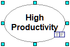
The Node button will become recessed and the cursor will change to an arrow with an ellipse in bottom right corner. Move the mouse to a clear portion of the screen inside QGeNIe window (the main model window is called the Graph View) and click the left mouse button. You will see a new node appearing on the screen as shown below:

The small squares around the node indicate that the node is selected. The most recently created node is automatically selected. You can also select any node by clicking on it. You can change the size of the selected node by dragging the small squares.
Once you have drawn the node on the Graph View, the Node button on the toolbar will become normal again and the Select Objects button will become recessed.
QGeNIe allows you to name nodes. Names are simply strings of any characters and any length. QGeNIe assigned the node that you have just created the name Node1. QGeNIe also placed the newly created node's name in Edit mode immediately, so you can enter a more descriptive name. In this case, we want to name it High Productivity.
All QGeNIe variables are binary and should refer to some proposition. The truth of this proposition will be the subject of inference in QGeNIe. It is a good heuristic to think of these propositions as desirable and undesirable. It is best to assign variable names that are meaningful and self-explanatory. Please note that QGeNIe does not put any limitations on the length of the names. When working with the model, posterior probabilities will be displayed by means of colors. Typically, one assigns green color to desirable propositions and red color to undesirable ones. Red has been found to draw user's attention and we advise that it be used to undesirable propositions. QGeNIe allows its user to define a node coloring scheme. When defining this scheme, it is a good idea to follow the meaning of the majority of nodes. Single nodes can be designated as having the reverse meaning and the coloring scheme will be reversed for them.
Similarly, we add nodes for the variables Hot Weather, Climate Control in the Building and Work To Do. It is worth mentioning here that if you want to draw multiple model elements of the same type, then you can avoid having to select the node button again and again by double-clicking on a Standard Toolbar button instead of single-clicking it the first time. This will place you in "sticky mode," in which the tool button stays recessed and you can draw multiple elements of that type. You can return to normal mode by clicking on the Select Objects button (![]() ) or clicking on the recessed button again. After adding the three nodes, we enter their names, resize them to look pretty and display the entire name, and move them to their destination positions using mouse drag and drop functionality. Here is what the effect of this operation could look like:
) or clicking on the recessed button again. After adding the three nodes, we enter their names, resize them to look pretty and display the entire name, and move them to their destination positions using mouse drag and drop functionality. Here is what the effect of this operation could look like:

B. Let us specify the causal connections between the nodes.
In order to represent the fact that each of the three nodes (Hot Weather, Climate Control in the Building and Work To Do) influences the node High Productivity, we will add influence arcs to the model.
Click on the Arc (![]() ) tool (note that the cursor changes), then click on the Hot Weather node, hold the left mouse button and drag the mouse to the node High Productivity, and release the button anywhere within the new node.
) tool (note that the cursor changes), then click on the Hot Weather node, hold the left mouse button and drag the mouse to the node High Productivity, and release the button anywhere within the new node.
GeNIe will draw an arc from Hot Weather node to High Productivity and display the following dialog:
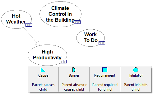
which allows you for specifying the type of causal relationship between Hot Weather and High Productivity. There are four possible types of causal relationships: Causes, Barriers, Requirements, and Inhibitors. Causes make their effects more likely, i.e., have a positive influence on their effects. Barriers have a negative effect. Requirements are necessary for the effects to happen. Inhibitors, when true, make the effect impossible. Each of these four types of relationships is imperfect, so the effect may happen even if the requirement is not present and may happen even if the requirement is absent. Similarly, an inhibitor may be imperfect and the effect may take place even if it is present or not take place even if it is absent.
In case of the causal relationship between Hot Weather and High Productivity, it is fair to assume that it is a Barrier - hot weather will tend to decrease productivity. We choose Barrier thus. Similarly, we draw arcs from Climate Control in the Building and Work To Do to High Productivity, making them a Cause (climate control should increase productivity) and a Requirement (existence of work to be done is a necessary condition for productivity) respectively. We obtain the following directed graph:
Please note that the heads of the arrows are all different, indicating the types of relationships between a cause and an effect.
C. Setting the desirable state for each node.
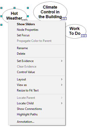
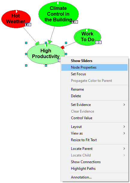
QGeNIe uses colors to show desirable and undesirable states. By default, these are the states True but this can be changed for each node individually. In our model, the state True of each of the variables is desirable, except for the node Hot Weather. Let us change the desirable state for node Hot Weather to False. To do that, we right-click on the node and choose Node properties:
Within node's properties, please check the Reverse colors check box:
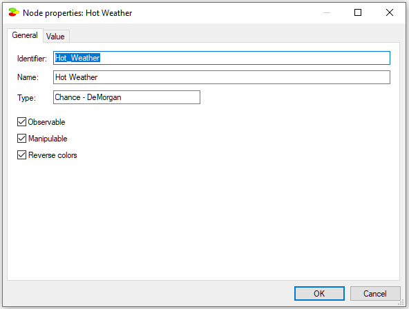
This will cause the node colors to follow the state False. Zero probability of Hot Weather will be shown as green and probability one will be shown as red.
D. Now, let us define the numerical properties of the model, i.e., nodes and the interactions among them.
There are two types of parameters in QGeNIe: (1) Node beliefs (probabilities), and (2) Interaction probabilities.
Node probabilities express either the prior probability of the proposition expressed by the node (for those nodes that have no parents in the model graph) or leak, which is the probability of the proposition when each of the node's parents is inactive. To change this probability for any node, just double-click on the node. This will result in dimming every node in the model except for Hot Weather and displaying a slider for changing the prior belief (prior probability) of the proposition Hot Weather:
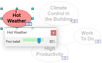
The prior probability of (degree of belief in) the proposition can be adjusted by moving the slider. You can also move the slides by finer steps (single percentiles) using the horizontal arrows on your keyboard. Let us move it to the value of 80%, which means that there is a prior probability of 80% of hot weather. As we move the slider, the color of the node changes. We repeat this for the node Climate Control in the Building:
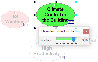
stating that there is 90% chance that climate control is operating in the building and for the node Work To Do:
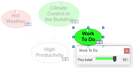
stating that 95% of the time there is work to do.
For any node that has parents in the graph, we specify two parameters: The Leak and the interaction probabilities. We will explain the meaning of these probabilities in section The DeMorgan gate in this manual. For now, we ask your patience and trust in the sound probabilistic meaning of these parameters. The only node with parents in this simple model is High Productivity. Double-clicking on this node invokes the slider for the Leak probability.
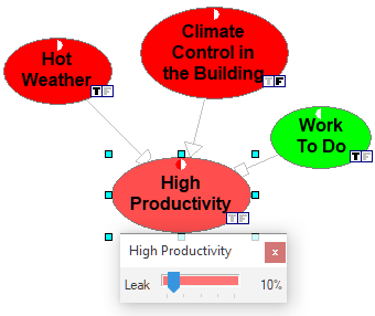
The Leak expresses the probability that High Productivity is going to be True when all of its parents are in their inactive states, i.e., the weather is going to be hot, there is going to be no climate control in the building, and there is going to be work to do, but no other unmodeled causal factors influencing productivity are present. Please note that the user interface to the elicitation shows you this situation by fixing the values of Hot Weather to True (T), Climate Control in the Building to False (F), and Work To Do to True (T). We estimate this probability to be 10%.
E. We will now specify the strength of influences of the different causal factors of High Productivity.
Interaction probabilities, also called Weights, generally describe the strengths of causes in their ability to influence the effect. The weight means something slightly different, depending on the type of interaction. Every variable in the model has a so-called "distinguished state," which is the state that exerts no influence on its children. For example, the distinguished state of Hot Weather is False, as hot weather will decrease productivity but its absence, i.e., mild weather, will have no influence on productivity. The distinguished state of Climate Control in the Building is False, as presence of climate control will influence productivity. The distinguished state of Work to Do is True, as having work to do is the normal situation that will not influence productivity. To learn more about the meaning of weights in each case, please look at the The DeMorgan gate section of this manual.
In order to change any of the interaction probabilities, just double-click on the corresponding arc.
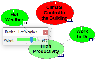
The weight of the influence can be adjusted by moving the slider. Weight of 80%, as pictured above, represents in case of a barrier, which is the relationship between Hot Weather and High Productivity, the probability that the productivity is going to be high if the weather is not hot, there is no climate control in the building and there is work to do. QGeNIe's user interface to the elicitation helps you with this by fixing the values of Hot Weather to False (F), Climate Control in the Building to False (F), and Work To Do to True (T). Please note that only the variable Hot Weather is not in its distinguished state when estimating this probability.
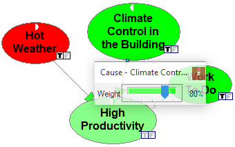
The Weight of the relationship between Climate Control in the Building and High Productivity of 80% (see the image below) means that there is 80% chance that the productivity is going to be high if the weather is hot, the climate control is present in the building, and there is work to do. QGeNIe's user interface to the elicitation helps you with this by fixing the values of Hot Weather to True (T), Climate Control in the Building to True (T), and Work To Do to True (T). Please note that only the variable Climate Control in the Building is not in its distinguished state when estimating this probability.
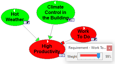
The Weight of the relationship between Work To Do and High Productivity of 99% (see the image below) means that there is 99% chance that the productivity is going to be low if there is no work to do, the weather is not hot and there is climate control in the building. QGeNIe's user interface to the elicitation helps you with this by fixing the values of Hot Weather to True (T), Climate Control in the Building to True (T), and Work To Do to False (F). In this case, none of the variables are in their distinguished states, as the relationship of a requirement with causes and barriers follows the AND function (more about this in the The DeMorgan gate section of this manual.
There is one more setting that we will perform - we will designate one of the nodes, High Productivity, as the focus of our analysis. Usefulness of this setting will become clear later in this section. To designate the High Productivity node as the focus of inference, please right-click on it and select Set Focus.
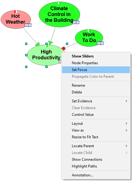
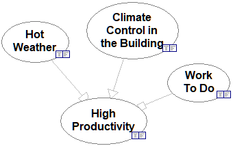
Let us pause for a moment and examine the graphical structure of our completed model:
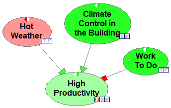
The structure shows causal interactions among the variables. We can see that hot weather, climate control, and availability of work to do all impact productivity. The influence of individual variables differs qualitatively. This is pictured by different arrowheads. Climate control impacts productivity positively, hot weather negatively, and work to do is a necessary condition for productivity to be high.
Colors of nodes reflect probabilities of the propositions that they represent. Generally, green color denotes probabilities that are within an acceptable range, red color denotes probabilities that are worrisome. Small circles on the top of each of the node help in judging the distance of the node color from the extremes (colors representing probabilities zero and one). Please note that one half of each circle is white and the other shows the color of the extreme. And so, Hot Weather node's probability is clearly on the side of red, between 0.5 (white color) and dark red (probability 1.0) shown by the other half of the small circle. The probability of Climate Control in the Building is quite close to 1.0 - please note that there is little difference between the node's color and the green half of the small circle.
There is one node (High Productivity) that is special and designated as the focus of reasoning (we will return to this in Section H). Each node has two small icons in its lower-right corner. These icons allow for setting an observation of the node and also show the observed value.
The model structure can be analyzed additionally by displaying the links between nodes (the arcs) in variable width, corresponding to the magnitude of their influence. To enable variable arc widths, press the Enable variable arc widths (![]() ) tool. This results in the following view:
) tool. This results in the following view:
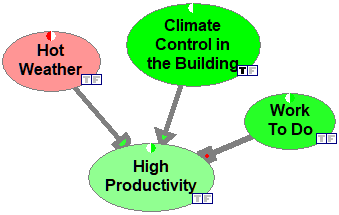
Please note that the thickness of each arc represents the strength with which the parent node influences the child node. It is useful for analyzing the critical paths of information flow.
F. At this point you should save your work.
1. Click on Save button (![]() ) on the Standard Toolbar.
) on the Standard Toolbar.
GeNIe will display the Save As.. dialog shown below:
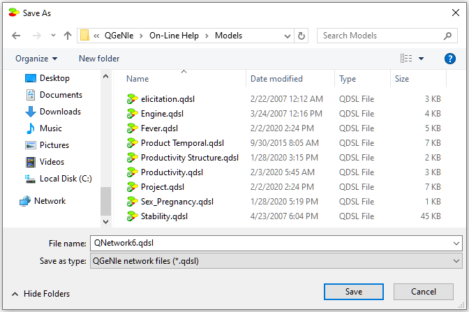
2. Enter Productivity as the File name and click on Save.
G. Now let us put our model to work and answer the question posed in the beginning of this tutorial.
To answer the question "What is the expected impact on productivity of failure of the climate control in the building on a hot day and on a normal day respectively?", you will need to tell QGeNIe that you have observed the Climate Control in the Building to be False. There are two ways of achieving this. The first, slightly more cumbersome, is to right-click on the node Climate Control in the Building and choose Set Evidence/False from the context menu that will pop up.
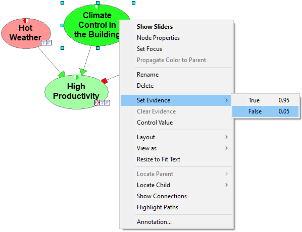
There are two shortcuts for observing a node's value: (1) through double-clicking on one of the small square icons (![]() ) in the lower-right corner of each node, or (2) through pressing the letter T or F (for True and False respectively). In this case, we double-click on the icon False (
) in the lower-right corner of each node, or (2) through pressing the letter T or F (for True and False respectively). In this case, we double-click on the icon False (![]() ) of the Hot Weather node, which makes the icon bold or press F once the node has been selected. Please note that every time that we make an observation of a node value, the colors of model nodes change. Colors represent probabilities of the selected states and are meant to draw your attention. We observe the impact of the two observation made (please note the bold observation icons in the picture below) on the node High Productivity.
) of the Hot Weather node, which makes the icon bold or press F once the node has been selected. Please note that every time that we make an observation of a node value, the colors of model nodes change. Colors represent probabilities of the selected states and are meant to draw your attention. We observe the impact of the two observation made (please note the bold observation icons in the picture below) on the node High Productivity.
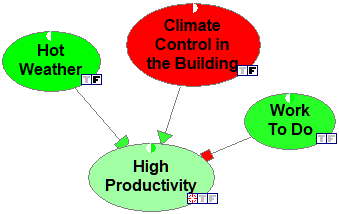
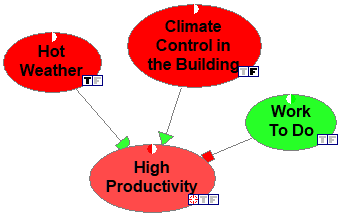
The colors indicate that a failing climate control will not have much of an impact when the day is not hot. Please note the general idea of showing colors in QGeNIe. When looking at the model, we can see that there is one variable that is a potential problem -- Climate Control in the Building, as its color is deep red. The other nodes and our focus variable, High Productivity in particular, seem to be fine and show as green. Let us change the observation for the node Hot Weather to True by double-clicking on the corresponding observation icon T. We can see in the image below that there are now three nodes that are in red: Climate Control in the Building, Hot Weather and High Productivity. Hot weather in combination with failing climate control in the building cause problems with productivity.
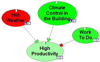
Will fixing the climate control help? We can check this by setting the Climate Control in the Building to be True by double-clicking on the corresponding observation icon and observe that the node High Productivity turns somewhat green again.
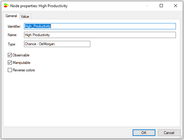
It is possible to see the exact numerical posterior probabilities of any of the propositions. For that, please right-click on the node in question and select Node Properties:
Please choose the Value tab in the property sheets,
which will look as follows:
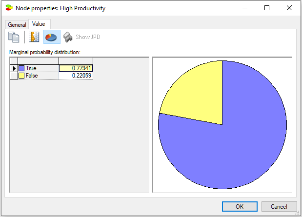
We can see that the numerical posterior probability of High Productivity being True is equal to 0.77941.
H. Value of observation and value of manipulation.
QGeNIe allows for calculating the value of observation and the value of manipulation based on a measure known as cross-entropy. Cross-entropy, or expected change in entropy, is a unit-less measure of the expected change in entropy of a focus variable in the model. In order to calculate the value of information, the model has to contain exactly one focus variable. We have set the focus variable to be High Productivity in Section E above. Please note that the node is marked by a target icon (![]() ).
).
Every node in the model can be marked as Observable and Manipulable by checking a corresponding check box in the node's property sheet.
Setting a node as Observable means that it is possible to observe its value (True or False), setting a node as manipulable means that it is possible to impose a value on it by means of an external intervention (this value is also True or False). We can, thus, observe the state of the climate control system or we can set its state (by turning it on or off, breaking it, or fixing it when broken). The difference between observation and manipulation is subtle but quite clear. It is possible, for example, to observe whether a day is hot but it may be impossible to make it hot. In case of climate control system, we can both observe its value and manipulate it. Once the model nodes have been marked as Observable or Manipulable, we can let QGeNIe calculate the value of observing any of the observable nodes and the value of manipulating any of the manipulable nodes from the point of view of learning more about the Focus variable (in this case, variable High Productivity). To invoke this calculation, please press the Most Effective Actions window icon (![]() ). This will open the following window pane.
). This will open the following window pane.
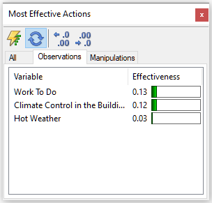
The Observations tab shows the list of all observable variables rank-ordered from the most informative to the least informative in learning the probability of the focus variable (High Productivity in our case). The numerical values are unit-less and express the expected change in entropy of the focus variable. It looks like observing whether there is enough work to do is the most informative for learning about high productivity.
Clicking on the Manipulations tab shows the list of all manipulable variables rank-ordered from the most effective to the least effective in changing the probability of the focus variable:
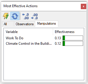
Please note that the list does not contain the variable Hot Weather, as it was not marked as Manipulable. It looks like making sure that there is enough work to do is the most effective way of increasing productivity.
What we have created is a simple qualitative causal model. You can create more complex models in a similar way.
You can find the above model named Productivity.qdsl in the Qualitative Models directory among other example models that come with QGeNIe or download it directly from our model repository.